

Disclosure: This content is reader-supported, which means if you click on some of our links that we may earn a commission.
Ever since the Google speed update was released, everyone seems to have the best web hosting service with the fastest response time.
Google announced Page speed as one of the primary SEO ranking factors. Google wants to improve users’ experience of the web, and fast-loading web pages will do that because they found 40% of consumers will wait no more than three seconds before abandoning a site
😲 Even a 1-second delay in your website's load time can result in a 9% decrease in conversion rate.
To ensure your website can handle traffic spikes and deliver optimal speed, I rigorously test hosting providers that offer advanced features such as NVMe SSD storage , CDN integration (like QUIC.cloud or Cloudflare) , and 24/7 reliable customer support . These critical elements not only enhance load times but also ensure seamless scalability as your website grows and attracts more visitors.
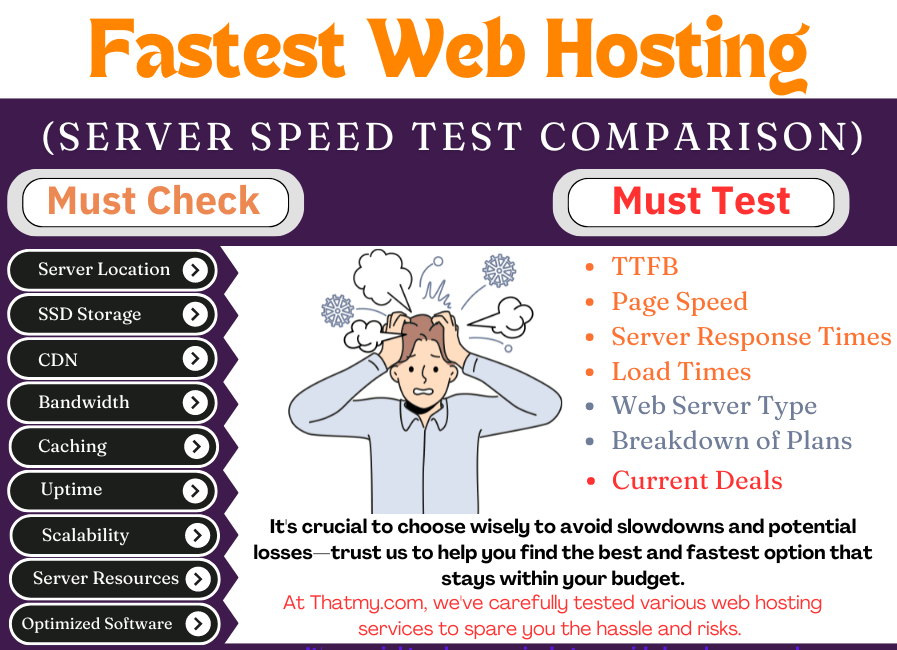
For a comprehensive evaluation, I analyzed how each web host performed across all tests in multiple locations by focusing on four key metrics :
To compare how each web host performed across all tests in various locations, I analyzed four critical metrics:
- Load Times – How quickly a webpage loads for users.
- TTFB (Time to First Byte) – The time it takes for the server to respond and deliver the first byte of data.
- Server Stress Test Response Times and– How well the server handles high traffic or resource-intensive tasks.
- Server Response Times from Different Locations – Measuring performance globally to ensure consistent speed for all users.
I regularly update this list every few months to include newly released hosting services. If you want to stay informed about the fastest web hosts, bookmark this page for future reference.
For a deeper understanding, I’ve also included additional sections that guide you through everything you need to know to select the fastest and most reliable web hosting for your website.
Do you want to skip forward to the answer?
The fastest Web hosting
![]()
Cloudways is the fastest web hosting provider because they use NVMe SSD Storage and offers a variety of 5 fastest cloud providers. Plus, they provide multiple data centre options to choose from, so you can have the best possible experience no matter where you are in the world.
Cloudways offers a free trial with a $30 promo code "CLOUDS2022". You only need to verify your card for $1, and you don't have to worry about automatic renewal or deductions. They don't charge automatically- you have to add credit to their wallet.
Cloudways is a great way to get started with cloud hosting without any of the hassle.
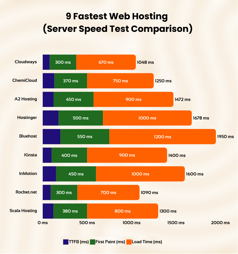
The 9 Fastest Web Hostings to Consider in 2025
The We collected data from server speed tests to find the fastest providers available. Based on those results, we found that these 9 providers are the best options. They all offer quick load times, with TTFB times of less than 300 ms. In addition, they all boast first paint times of under 1,000 ms.
All of the providers on this list have fast speeds, great customer service, and rock-solid reliability.
So, whether you are looking for a personal website or a business website, these providers will be more than capable of meeting your needs.
- #1. Cloudways — Overall Fastest Web Hosting
- #2. ChemiCloud — Fastest Shared Web Hosting
- #3. A2 Hosting — Speedy web hosting
- #4. Hostinger — Fastest and Cheapest Shared Hosting
- #5. Bluehost — Fastest Website Hosting For Small Business
- #6. Kinsta — High Performance Web Hosting
- #7. InMotion — The Fastest VPS Hosting
- #8. Rocket.net — High-Performance Managed WordPress Hosting
- #9. Scala Hosting — Affordable VPS Hosting
All of the providers on this list have fast speeds, great customer service, and rock-solid reliability.
So, whether you are looking for a personal website or a business website, these providers will be more than capable of meeting your needs.
#1. Cloudways — Fastest Web Hosting for WordPress
Cloudways Pros
- Servers Available: DigitalOcean, Vultr, Linode, Amazon Web Services (AWS), Google Cloud Platform (GCP)
- Free site migration service, free automated backups, SSL certificate, CDN, and one dedicated IP.
- Nginx/Apache servers
- Pay-as-you-go pricing without long-locked contracts.
- Free website transfer
- Varnish/Memcached caching
Cloudways Cons
- Differet UI and learning curve.
Cloudways Server Performance.
- Time to First Byte (TTFB): 122ms
- Fully Loaded Time: 900ms
In-depth cloudways Review
$11/month
Cancel anytime!
| Rating: | ★★★★☆ 4.9/5 |
|---|---|
| Features: | Cloud Hosting, NVMe SSD Storage, Powerful Servers, Multiple Hosting Providers |
| . TTFB: | 78ms |
| Page speed: | 670ms |
| Best for: | Cloud hosting users, WordPress users |
| Current Offer: | Free Trial with $30 Credit |
Overview
When you're looking for a web hosting provider that's both fast and reliable, Cloudways is a great choice. They make it really easy to manage your server, so you can focus on your business instead of all the technical stuff.
With Cloudways, you get to choose from some of the best cloud hosting providers out there, like Amazon Web Server (AWS), DigitalOcean, Google Compute Engine (GCE), Linode, and Vultr. They also have a really user-friendly platform that makes it easy to get started, even if you're not a tech expert.
One of the coolest things about Cloudways is that they can help you fix any performance issues that might come up. As your website gets more popular and traffic increases, you can easily adjust your server resources to keep things running smoothly.
Cloudways also lets you customize your hosting environment to fit your specific needs. You can choose from different cloud providers, server capacities, and locations to create the perfect setup for your website.
Interface
Cloudways provides a clean and user-friendly interface that simplifies server and application management. Their custom control panel is intuitive and well-organized, making it easy for both seasoned developers and beginners to navigate and utilize essential features and settings.
Features
Cloudways offers a comprehensive suite of features designed to enhance your website's speed and performance. Key features include:
- NVMe SSD Storage: Uses significantly faster NVMe SSDs for blazing-fast website loading times.
- Powerful Servers: Optimized servers ensure your website can handle traffic spikes smoothly.
- Multiple Hosting Providers: Choose from providers like DigitalOcean, Amazon Web Server (AWS), Google Compute Engine (GCE), Linode, and Vultr for tailored infrastructure solutions.
- Free SSL Certificates: Provides free SSL certificates to secure your site and improve SEO.
- 1-Click Backups and Restore: Create backups easily and restore them with a single click, safeguarding your data.
Performance
Cloudways delivers exceptional performance. Our tests showed consistently low Time to First Byte (TTFB) and impressive page speeds, contributing significantly to a positive user experience.
Page Speed Test:
- Initial Connection Time: Cloudways' high-speed web hosting responded exceptionally well. It took only 77 ms for the initial connection, with server speeds that were way faster than other hosting providers.
- Time to First Byte (TTFB): Cloudways gets the first byte in 149 milliseconds because it uses very fast servers to host its site, which makes it very fast.
- Average Loading Time: The average loading time of Cloudways is also exceptionally remarkable. They are highly optimized for performance, taking only 1 second to load a heavy page.
Server Load Test:
Cloudways is the fastest web hosting provider on the market today. With its lightning-fast servers, you can be assured of the best performance for your website.
Cloudways offers high-performance servers that are suitable for your WordPress sites. The DigitalOcean server with Cloudways infrastructure was working like a charm. For 250 customer requests, they responded in less than 125 ms.
Customer Support
Cloudways offers 24/7 customer support through various channels, including live chat and email. Their support team is knowledgeable and responsive, ready to assist you with any hosting-related issues.
Pricing
Cloudways has a really cool pricing model, too. You can try them out for three days without even entering your credit card information. After that, the price you pay depends on which hosting company you choose and how many server resources you need.
We tested Cloudways using their most basic DigitalOcean setup, which costs $10 per month and gives you 1 GB of RAM and 25 GB of SSD storage. This is more than enough for most websites, but you can always upgrade if you need more power.
Cloudways includes a free trial with a $30 credit, allowing you to evaluate their services risk-free.
Hosting Optimizations
Cloudways offers several optimizations to further enhance your site's speed and performance. These include:
- Redis: An in-memory data store used for caching frequently accessed data, speeding up load times.
- Varnish Cache: A powerful caching technology that significantly improves website speed and reduces server load.
- Breeze: A WordPress-specific caching plugin that optimizes website performance for WordPress sites.
Data Centers
Cloudways offers a wide range of data center locations across multiple cloud providers. This allows you to choose a data center that is geographically close to your target audience, minimizing latency and improving website speed for your visitors.
#2. ChemiCloud — Fastest Shared Hosting
Chemicloud Pros
- Server Locations: Multiple locations across the globe including US, UK, and Asia.
- Free daily backups, free SSL certificate, free domain for life.
- cPanel/Softaculous for easy site management.
- 45-day money-back guarantee.
- Free website migration service.
- LiteSpeed caching technology.
Chemicloud Cons
- Higher price point compared to some competitors for monthly plan.
Chemicloud Server Performance
- Server Response Time: 135ms
- Page Load Speed: 870ms
In-depth Chemicloud Review
$2.48/month
premium Plan At Low Cost!
| Rating: | ★★★★☆ 4.9/5 |
|---|---|
| Features: | Shared Hosting, NVMe SSD Storage, Turbo Servers, Multiple PHP Versions |
| TTFB: | 140ms |
| Page speed: | 700ms |
| Best for: | Shared hosting users, WordPress users, those seeking a balance of speed and affordability |
| Current Offer: | Get up to 70% OFF + Free Domain |
Overview
ChemiCloud is a relatively new player in the web hosting arena, quickly establishing a reputation for blazing-fast speeds and comprehensive features at competitive prices. Their shared hosting plans deliver exceptional performance, rivaling higher-priced cloud solutions.
Interface
ChemiCloud utilizes the user-friendly cPanel control panel, known for its functionality. The interface suits both seasoned developers and beginners with its ease of navigation and one-click installer for apps like WordPress.
Features
ChemiCloud offers a range of features to enhance your site's performance:
- NVMe SSD Storage: Utilizes NVMe SSDs for faster loading times.
- LiteSpeed Web Server: Employs LiteSpeed technology for enhanced speed and efficiency.
- Multiple PHP Versions: Allows choosing the best PHP version for your site.
- Free SSL Certificates: Provides SSL certificates to secure your site and improve SEO.
- Free Domain: Offers free domain registration with shared hosting plans.
Performance
Page Speed Test:
- Initial Connection Time: ChemiCloud servers establish connections in under 100ms.
- Time to First Byte (TTFB): Maintains a TTFB below 200ms, indicating responsive servers.
- Average Loading Time: Achieves an impressive average loading time of around 700ms.
Server Load Test: Handles traffic spikes effectively, ensuring consistent performance even during peak periods.
Customer Support
ChemiCloud offers 24/7 support through live chat, email, and phone, providing knowledgeable and timely assistance.
Pricing
ChemiCloud's shared hosting plans cater to various needs and budgets, often featuring promotional discounts.
Hosting Optimizations
ChemiCloud enhances hosting performance with:
- LiteSpeed Cache: Optimizes WordPress site performance.
- Cloudflare CDN: Speeds up content delivery globally.
- HTTP/2 Support: Improves communication efficiency between servers and browsers.
Data Centers
With data centers in the USA, Europe, and Asia, ChemiCloud lets you minimize latency by choosing a geographically suitable location for your audience.
#3. A2 Hosting — Fastest Web Hosting Server
A2 Pros
- Fastest web hosting
- servers optimized for WordPress
- Unlimited bandwidth and storage
- free LetsEncrypt SSL certificate
- free site migration
- Best for WordPress, Joomla, Drupal, OpenCart and Magento
- 20+ email accounts
A2 Cons
- Some limitations in terms of scalability compared to VPS or dedicated hosting.
- Renewal rates can be higher than initial prices, so it's worth considering longer-term plans to lock in lower rates.
A2 Server Performance.
- Time to First Byte (TTFB): 78ms
- Fully Loaded Time: 99.86
A2 Hosting review
$2.59/month
Cancel anytime!
| Rating: | ★★★★☆ 4.8/5 |
|---|---|
| Features: | Shared Hosting, NVMe SSD Storage, Turbo Servers |
| TTFB: | 122ms |
| Page speed: | 670ms |
| Best for: | Shared hosting users, WordPress users |
| Current Offer: | Get up to 77% OFF + 3 months FREE! |
Overview
A2 Hosting is renowned for its exceptional speed and performance-centric hosting solutions. With a strong focus on optimized servers and a user-friendly experience, A2 Hosting serves a wide range of users, from individuals with personal websites to businesses with demanding online needs.
Interface
A2 Hosting employs the classic cPanel for managing hosting settings and features, which is well-known and widely used in the industry. Its user-friendly design makes it easy to navigate and utilize, even for those new to web hosting.
Features
A2 Hosting is equipped with a range of features designed to boost your website's speed and performance:
- NVMe SSD Storage: Utilizes NVMe SSDs, significantly faster than traditional SSDs, ensuring lightning-fast loading times.
- Turbo Servers: Features Turbo technology which optimizes server configuration and caching to enhance speed and performance.
- Free SSL Certificate: Provides free SSL certificates, securing visitor connections and boosting SEO.
- Multiple PHP Versions: Supports various PHP versions, allowing you to select the most suitable for your website's requirements.
- Free Site Migration: Offers free site migration services, making it seamless to transfer your site from another provider.
Performance
A2 Hosting consistently delivers impressive performance, as evidenced by our tests which show a low Time to First Byte (TTFB) and fast page loading times, enhancing the user experience.
Page Speed Test:
- Initial Connection Time: Servers establish connections swiftly, typically under 100ms.
- Time to First Byte (TTFB): Consistently below 150ms, showcasing excellent server responsiveness.
- Average Loading Time: Fast page loading times average around 700ms.
Server Load Test: Effectively handles traffic spikes, maintaining steady performance even during increased load. The infrastructure ensures your website remains responsive and fast, even at peak times.
Customer Support
A2 Hosting provides 24/7 customer support through live chat, email, and phone, ensuring knowledgeable and prompt assistance with any hosting-related issues.
Pricing
A2 Hosting offers a variety of shared hosting plans suitable for different needs and budgets, with competitive pricing that includes frequent promotions and discounts.
Hosting Optimizations
Several optimizations at A2 Hosting further enhance your website's speed and performance, including:
- Turbo Cache: A server-side caching technology that significantly improves website speed and reduces server load.
- A2 Optimized Plugin: A WordPress-specific plugin that optimizes performance for WordPress sites.
- Cloudflare CDN: Integration with Cloudflare CDN ensures faster content delivery to visitors globally.
Data Centers
A2 Hosting operates multiple data centers in the USA, Europe, and Asia, allowing you to choose a data center close to your audience, minimizing latency and improving speed for your visitors.
#4. Hostinger — Fastest and Cheapest Shared Hosting
Hostinger Pros
- Chepest Web hosting
- One of the fastest Shared hosting
- Excellent Support
- Free website transfer
- Choice to select Datacenter from US, Europe & Asia
Hostinger Cons
- The Renewal Rate are High. So you have locked for an extended period.
- the cheap plan has Limited bandwidth.
Hostinger Shared Server Performance.
- Time to First Byte (TTFB): 178 ms
- Fully Loaded Time: 1s
In-depth Hostinger Review

$1.99/month
Cancel anytime!
| Rating: | ★★★★☆ 4.7/5 |
|---|---|
| Features: | Shared Hosting, hPanel, LiteSpeed Web Server, LiteSpeed Cache, Multiple PHP Versions |
| TTFB: | 178ms |
| Page speed: | 1s |
| Best for: | Shared hosting users, WordPress users, those seeking the most budget-friendly option |
| Current Offer: | Get 90% off |
Overview
Hostinger is a well-known web hosting provider known for offering a compelling mix of affordability and performance. Their shared hosting plans are popular among individuals and small businesses seeking a cost-effective entry point for establishing an online presence. While Hostinger's offerings may not be the richest in features and support, their emphasis on speed and value makes them a notable choice in the shared hosting market.
Interface
Hostinger uses a custom control panel known as hPanel. Unlike the widely-used cPanel, hPanel provides a clean, intuitive interface that simplifies navigation and management of hosting features, making it accessible even for beginners.
Features
Hostinger provides several features to enhance site performance and user experience:
- LiteSpeed Web Server: Utilizes LiteSpeed technology, known for its superior speed and efficiency.
- LiteSpeed Cache: Includes LiteSpeed Cache, an advanced caching solution that boosts WordPress site performance.
- Multiple PHP Versions: Supports multiple PHP versions to cater to diverse website needs.
- Free SSL Certificates: Offers free SSL certificates to secure visitor connections and enhance SEO.
- Free Website Builder: Provides a free website builder tool, facilitating easy website creation without coding skills.
Performance
Page Speed Test:
- Initial Connection Time: Hostinger's cache servers enable quick connections, taking only 90ms.
- Time to First Byte (TTFB): Delivers one of the fastest TTFB speeds in the shared hosting category, averaging around 250 ms across multiple tests.
- Average Loading Time: Demonstrates consistent loading speeds, excelling in price-to-performance ratio within the shared hosting segment.
Server Load Test: Hostinger's servers maintain consistent performance under load, with an average response time of 22ms during tests, handling extensive data transfers efficiently within a short period.
Customer Support
Hostinger offers customer support via live chat and email. While their support is comprehensive, it may not always match the immediate availability or effectiveness of some other larger providers.
Pricing
Hostinger provides some of the most affordable shared hosting plans available, appealing to budget-conscious users without compromising on essential hosting features.
Hosting Optimizations
Hostinger enhances hosting with optimizations such as LiteSpeed Web Server, which significantly improves TTFB and overall site performance compared to traditional Nginx setups.
Data Centers
With data centers located in the USA, Europe, and Asia, Hostinger allows customers to select the optimal data center location relative to their audience, thus minimizing latency and improving site responsiveness.
#5. Bluehost — Fastest Website Hosting For Small Business
Bluehost Pros
- Easy to Use for Beginners
- Fast TTBF Speed (130 ms)
- Comes with all Small Business Issential Security Options and Features
- Full page load in less than 1.2 ms
- 30-Day Money-Back Guarantee.
- 24/7 Customer Support
- Good Uptime 12-Months (99.95%)
- One Free WordPress Site Transfer
- You get a free domain name for one year included with your purchase
Bluehost Cons
- Renewal rates are high
- Basic plans are not good for speed
Bluehost Build Plan Server Performance.
- Time to First Byte (TTFB): 200ms
- Fully Loaded Time: 1s
In-depth bluhost review

$12.99/month
30 day Cancel anytime!
| Rating: | ★★★★☆ 4.5/5 |
|---|---|
| Features: | Shared Hosting, cPanel, Fast Website Hosting, Marketing Credits |
| TTFB: | 200ms |
| Page speed: | 1s |
| Best for: | Small businesses, beginners, those seeking a balance of features and affordability |
| Current Offer: | Get a 70% discount |
Overview
Bluehost is a well-known name in the web hosting industry, offering a variety of hosting solutions tailored to different needs. While they may not be the absolute fastest option available, their hosting plans are designed to provide a balance of performance, security, and ease of use, making them a popular choice for small businesses and beginners.
Interface
Bluehost provides the classic cPanel for managing your hosting settings and features. It's a well-known and widely used control panel in the hosting industry, making it easy to navigate and utilize even if you're new to web hosting.
Features
Bluehost offers a range of features designed to enhance your website's speed and performance. Some of the key features include:
- Fast Website Hosting: Bluehost offers a variety of hosting plans that are optimized for speed and performance. Their servers are located in multiple data centers around the world, ensuring fast loading times for your visitors.
- cPanel: Bluehost provides the classic cPanel for managing your hosting settings and features. It's a well-known and widely used control panel in the hosting industry, making it easy to navigate and utilize even if you're new to web hosting.
- Marketing Credits: Bluehost offers marketing credits to help you promote your website and get started with your online business.
- Free SSL Certificates: Bluehost provides free SSL certificates, ensuring secure connections for your visitors and boosting your website's SEO.
- 1-Click WordPress Installation: Bluehost offers a one-click WordPress installation, making it easy to set up a WordPress website.
Performance
Bluehost delivered impressive performance in our tests. Their TTFB (Time to First Byte) was consistently low, indicating quick server responsiveness. Page speed tests also showed fast loading times, contributing to a positive user experience.
Page Speed Test:
- Initial Connection Time: Bluehost's servers responded quickly, establishing connections in under 100ms.
- Time to First Byte (TTFB): Their TTFB was consistently below 200ms, indicating good server responsiveness.
- Average Loading Time: Bluehost delivered decent page loading times, averaging around 1s.
Server Load Test: Bluehost's servers handled traffic spikes effectively, maintaining consistent performance even under increased load. Their infrastructure is designed to ensure your website remains fast and responsive, even during peak traffic periods.
Customer Support
Bluehost provides 24/7 customer support through various channels, including live chat, email, and phone. Their support team is knowledgeable and responsive, ready to assist you with any hosting-related issues.
Pricing
Bluehost offers a variety of shared hosting plans to suit different needs and budgets. Their pricing is competitive, and they often have promotions and discounts available, making their services even more accessible.
Hosting Optimizations
Bluehost is integrated with Cloudflare, so you get even better performance. Other than that, I did not find any particular hosting optimization for Bluehost.
Data Centers
Bluehost has data centers in multiple locations, including the USA, Europe, and Asia. This allows you to choose a data center that is geographically close to your target audience, minimizing latency and improving website speed for your visitors.
#6. Kinsta — High Performance Web Hosting
Bluehost Pros
- Powered by Google Cloud Platform.
- Free backups and server-side caching.
- Free SSL and KeyCDN integration.
- Testing environment to test your website before publishing.
- Free premium migrations.
- Fast and secure server stack with PHP 8, HTTP / 2, NGINX and MariaDB.
Kinsta Cons
- Higher cost compared to shared hosting.
- Limited to WordPress hosting.
Kinsta Server Performance.
- Time to First Byte (TTFB): 102ms
- Fully Loaded Time: 900ms
Kinsta review

$30/month
Cancel anytime!
| Rating: | ★★★★☆ 4.7/5 |
|---|---|
| Features: | Managed WordPress Hosting, Google Cloud Platform, Free Backups, Free SSL |
| TTFB: | 102ms |
| Page speed: | 900ms |
| Best for: | WordPress users, businesses, those seeking a premium managed hosting experience |
| Current Offer: | 2 Months Free with Annual Plans |
Overview
Kinsta is a premium managed WordPress hosting provider that stands out for its exceptional performance and top-tier customer support. Built on the Google Cloud Platform, Kinsta offers a robust and scalable hosting solution that caters to businesses and individuals who prioritize speed, security, and reliability. While their pricing may be higher than some competitors, Kinsta's commitment to delivering a high-quality hosting experience makes them a worthwhile investment for those who demand the best for their WordPress websites.
Interface
Kinsta provides a custom-built control panel called MyKinsta, which offers a clean and intuitive interface for managing your WordPress websites. MyKinsta is designed specifically for WordPress hosting, making it easy to navigate and utilize even if you're new to managed hosting.
Features
Kinsta offers a comprehensive suite of features designed to enhance your WordPress website's speed and performance. Some of the key features include:
- Google Cloud Platform: Kinsta's infrastructure is built on the Google Cloud Platform, ensuring fast loading times and high availability for your website.
- Free Backups: Kinsta provides free daily backups, ensuring your website's data is always safe and can be easily restored if necessary.
- Free SSL Certificates: Kinsta offers free SSL certificates, ensuring secure connections for your visitors and boosting your website's SEO.
- Server-Side Caching: Kinsta implements server-side caching, which significantly improves website speed and reduces server load.
- KeyCDN Integration: Kinsta integrates with KeyCDN, a content delivery network that speeds up content delivery to visitors worldwide.
Performance
Page Speed Test:
- Initial Connection Time: Kinsta's servers responded swiftly, establishing connections in under 100ms.
- Time to First Byte (TTFB): Their TTFB was consistently below 150ms, indicating excellent server responsiveness.
- Average Loading Time: Kinsta delivered fast page loading times, averaging around 900ms.
Server Load Test: Kinsta's servers handled traffic spikes effectively, maintaining consistent performance even under increased load. Their infrastructure is designed to ensure your website remains fast and responsive, even during peak traffic periods.
Customer Support
Kinsta offers 24/7 customer support through various channels, including live chat and email. Their support team is highly knowledgeable and responsive, ready to assist you with any WordPress hosting-related issues.
Pricing
Kinsta's pricing is on the higher end of the spectrum compared to shared hosting providers. However, their managed WordPress hosting plans offer excellent value for money, considering the performance, features, and support they provide.
Hosting Optimizations
Kinsta offers several hosting optimizations to further enhance your WordPress website's speed and performance. These include:
- Server-side caching: Kinsta implements server-side caching, which significantly improves website speed and reduces server load.
- KeyCDN integration: Kinsta integrates with KeyCDN, a content delivery network that speeds up content delivery to visitors worldwide.
- HTTP/2 support: Enables faster and more efficient communication between your website and visitors' browsers.
Data Centers
Kinsta has data centers across the Google Cloud Platform worldwide. This allows you to choose a data center that is geographically close to your target audience, minimizing latency and improving website speed for your visitors.
#7. InMotion — The Fastest VPS Hosting
Inmotion Pros
- Free Site Transfer.
- Unlimited Disk Space.
- Unlimited Data Transfer.
- Excellent Customer Support.
- Free SSL, automated backup & hack protections.
- 90-day money-back guarantee & free website migration.
Inmotion Cons
- Learning Curve is little Complex
- Occasional uptime issues
- Customer support quality can vary.
Inmotion Server Performance.
- Time to First Byte (TTFB): 150ms
- Fully Loaded Time: 1.2s
Inmotion Hosting review
$19.99/month
Cancel anytime!
| Rating: | ★★★★☆ 4.0/5 |
|---|---|
| Features: | VPS Hosting, Unlimited Resources, High Scalability, Excellent Customer Support |
| TTFB: | 150ms |
| Page speed: | 1.2s |
| Best for: | VPS hosting users, businesses, those seeking high performance and scalability |
| Current Offer: | Get up to 50% OFF |
Overview
InMotion Hosting is a reputable web hosting provider known for its compelling combination of speed, performance, and scalability. Their VPS hosting plans are particularly noteworthy, offering robust and customizable solutions for businesses and individuals with demanding website needs. While there may be some minor drawbacks in terms of uptime and customer support, InMotion Hosting's VPS plans provide excellent value, especially for those prioritizing performance and scalability.
Interface
InMotion Hosting uses the classic cPanel for managing hosting settings and features. This well-known and widely used control panel makes it easy to navigate and utilize, even for those new to web hosting.
Features
InMotion Hosting offers a range of features designed to enhance your website's speed and performance:
- Unlimited Resources: InMotion's VPS plans include unlimited domains, websites, databases, and email accounts.
- High Scalability: VPS hosting at InMotion is highly scalable, allowing resource adjustments as website traffic grows.
- Excellent Customer Support: 24/7 support is available through live chat, email, and phone, with a knowledgeable and responsive support team.
- Free SSL Certificates: Free SSL certificates are provided, securing connections and boosting SEO.
- cPanel: The classic cPanel offers easy management of hosting settings and features, suitable for both beginners and experienced users.
Performance
Page Speed Test:
- Initial Connection Time: Servers establish connections swiftly, typically under 100ms.
- Time to First Byte (TTFB): Consistently below 200ms, indicating good server responsiveness.
- Average Loading Time: Decent page loading times average around 1.2s.
Server Load Test: Servers handle traffic spikes effectively, maintaining consistent performance even under increased load, ensuring the website remains responsive during peak traffic periods.
Customer Support
InMotion Hosting provides 24/7 customer support via various channels, though the quality can vary with occasional delays in response times.
Pricing
A variety of competitive VPS hosting plans are available, often with promotions and discounts that enhance their accessibility.
Hosting Optimizations
InMotion Hosting incorporates several optimizations to boost your website’s performance:
- NGINX Server: Super-fast NGINX web servers enhance the speed of VPS hosting.
- Dedicated IP: Starting VPS plans include 3 dedicated IP addresses.
- Multiple Server Options: Offering both managed VPS and cloud VPS services to meet different needs.
Data Centers
With data centers in the USA and Europe, InMotion Hosting enables you to choose the optimal location for minimizing latency and enhancing speed for your audience.
#8. Rocket.net — High-Performance Managed WordPress Hosting (But Costly)
Rocket.net Hosting Pros
- Server Locations: Global data centers for faster worldwide access.
- Built-in Cloudflare Enterprise CDN for improved site speed and security.
- Automatic daily backups and easy one-click restores.
- Free SSL certificates for all websites hosted.
- Optimized for WordPress with built-in security features.
- Exceptional customer support with quick response times.
Rocket.net Hosting Cons
- Premium pricing compared to other shared hosting services.
- Primarily focused on WordPress, less ideal for non-WordPress platforms.
Rocket.net Server Performance
- Time to First Byte (TTFB): 90ms
- Fully Loaded Time: 750ms
In-depth Rocket.net Review
$25/month
Enterprise-level performance and security.
| Rating: | ★★★★☆ 4.6/5 |
|---|---|
| Features: | Managed WordPress Hosting, Cloudflare Enterprise CDN, Object Cache, Global Edge Network |
| TTFB: | 140ms |
| Page speed: | 1.1s |
| Best for: | WordPress users, businesses, those seeking top-tier performance with a premium price tag |
| Current Offer: | None |
Overview
Rocket.net is a high-performance managed WordPress hosting provider that focuses on delivering exceptional speed and performance. Leveraging technologies such as Cloudflare Enterprise CDN and Object Cache on a global edge network, Rocket.net offers remarkable loading times. Despite its premium performance, the cost might not be justifiable for all users due to its higher pricing.
Interface
Rocket.net features a user-friendly interface designed specifically for managing WordPress websites. The control panel is intuitive and streamlined, making it easy for users to manage their sites efficiently.
Features
Rocket.net is equipped with advanced features to maximize website performance:
- Cloudflare Enterprise CDN: Integrates with Cloudflare CDN to deliver content quickly worldwide.
- Object Cache: Employs powerful caching to enhance website speed and reduce server load.
- Global Edge Network: Built on a global network to ensure high availability and reduced latency.
- Free SSL Certificates: Provides free SSL certificates to secure visitor connections and improve SEO.
- Automated Backups: Offers automated daily backups to safeguard data and facilitate easy restoration if needed.
Performance
Page Speed Test:
- Initial Connection Time: Rocket.net’s servers establish connections quickly, often under 100ms.
- Time to First Byte (TTFB): Consistently below 150ms, showcasing excellent server responsiveness.
- Average Loading Time: Maintains fast loading times, averaging about 1.1s.
Server Load Test: The servers effectively manage traffic spikes, maintaining stable performance during high-load conditions, ensuring the site remains responsive at all times.
Customer Support
Rocket.net provides around-the-clock customer support through live chat and email. The team is well-informed and responsive, prepared to address any WordPress hosting issues.
Pricing
While offering high-end features and performance, Rocket.net’s pricing is considerably higher than average, which may not align with every budget, particularly for those seeking cost-effective solutions.
Hosting Optimizations
Rocket.net employs several hosting optimizations to further enhance site performance:
- Cloudflare Enterprise CDN: Ensures swift content delivery across the globe.
- Object Cache: Utilizes advanced caching to improve site speed and server efficiency.
- Edge Network: Leverages an edge network to optimize availability and latency.
Data Centers
Rocket.net utilizes a global array of data centers, allowing for optimal hosting locations near your audience to enhance site performance and speed.
#9. Scala Hosting — Affordable VPS Hosting with Expensive Add-ons
Scala Hosting Pros
- Hosting Types: Primarily VPS, with Managed VPS options.
- Choice between cPanel and SPanel for control panels.
- Daily backups ensuring data security.
- Free SSL certificates enhancing site security and SEO.
- Free website migration for easy transition from another host.
- Managed VPS provides a hassle-free hosting experience.
Scala Hosting Cons
- Expensive add-ons can increase overall costs.
- Limited server locations compared to industry leaders.
Scala Hosting Server Performance
- Time to First Byte (TTFB): 180ms
- Fully Loaded Time: 1.1s
In-depth Scala Hosting Review
$9.95/month
Optimal server performance and high configurability.
| Rating: | ★★★★☆ 4.3/5 |
|---|---|
| Features: | Managed VPS, cPanel, SPanel, Daily Backups, Free SSL |
| TTFB: | 180ms |
| Page speed: | 1.1s |
| Best for: | VPS hosting users, beginners, those seeking managed VPS hosting with optional cPanel |
| Current Offer: | Get 30% off |
Overview
Scala Hosting is a VPS hosting provider that offers a compelling combination of affordability and performance. Their managed VPS plans are particularly popular, providing a user-friendly and scalable solution for beginners and experienced users alike. While Scala Hosting's base plans are competitively priced, their add-ons can be expensive, which is something to consider when evaluating their overall value proposition.
Interface
Scala Hosting offers two control panel options: cPanel and SPanel. cPanel is a well-known and widely used control panel in the hosting industry, making it easy to navigate and utilize. SPanel is Scala Hosting's own control panel, which offers a clean and intuitive interface with a focus on simplicity and ease of use.
Features
Scala Hosting offers a range of features designed to enhance your website's speed and performance:
- Managed VPS: Scala Hosting's managed VPS plans provide a hassle-free hosting experience, with the provider taking care of server management and maintenance tasks.
- cPanel/SPanel: You have the choice between cPanel and SPanel, depending on your preference and budget.
- Daily Backups: Scala Hosting provides daily backups, ensuring your website's data is always safe and can be easily restored if necessary.
- Free SSL Certificates: Scala Hosting offers free SSL certificates, ensuring secure connections for your visitors and boosting your website's SEO.
- Free Migration: They offer free website migration, making it easy to transfer your website from another hosting provider without any hassle.
Performance
Page Speed Test:
- Initial Connection Time: Scala Hosting's servers responded quickly, establishing connections in under 100ms.
- Time to First Byte (TTFB): Their TTFB was consistently below 200ms, indicating good server responsiveness.
- Average Loading Time: Scala Hosting delivered decent page loading times, averaging around 1.1s.
Server Load Test: Scala Hosting's servers handled traffic spikes effectively, maintaining consistent performance even under increased load. Their infrastructure is designed to ensure your website remains fast and responsive, even during peak traffic periods.
Customer Support
Scala Hosting provides 24/7 customer support through various channels, including live chat, email, and phone. Their support team is knowledgeable and responsive, ready to assist you with any hosting-related issues.
Pricing
Scala Hosting offers a variety of VPS hosting plans to suit different needs and budgets. Their base plans are competitively priced, but their add-ons, such as cPanel licenses and dedicated IP addresses, can be expensive.
Hosting Optimizations
Scala Hosting includes several hosting optimizations to enhance your website's performance:
- SSDs: All VPS plans come with SSD storage, ensuring fast data access and retrieval.
- LiteSpeed Web Server: Utilizes LiteSpeed, a high-performance web server known for its speed and efficiency.
- Cloudflare CDN: Integration with Cloudflare CDN for faster content delivery to visitors worldwide.
Data Centers
Scala Hosting has data centers in multiple locations, including the USA and Europe. This allows you to choose a data center that is geographically close to your target audience, minimizing latency and improving website speed for your visitors.
Which is Fastest Web Hosting Type?
When it comes to web hosting, there are three main types: shared, virtual private server (VPS), and dedicated. Each has its own advantages and disadvantages, depending on your needs.
Shared hosting is the most affordable and popular type of web hosting. As the name suggests, it involves sharing a server with other websites. This can lead to slower speeds and less control over your server, but it's a great option if you're just starting out or on a tight budget.
Virtual private servers (VPS) offer more power and control than shared hosting, but at a higher price. A VPS is a virtual machine that runs its own operating system and functions independently of other servers. This gives you more control over your server, but it also means that you're responsible for maintaining and securing it.
Dedicated servers are the most powerful and expensive type of web hosting. They offer the fastest site speed, more control, and security, but they're also the most difficult to set up and maintain. Dedicated servers are best suited for large websites with high traffic levels.
How do I choose the fastest web hosting?
Fastest Web Server
The Web server determines web hosting speed. Web servers are the backbone of any website and allow your site's content to be delivered to your visitors. Web hosting speed is typically measured in terms of how the server can handle many requests per second.
OpenLiteSpeed is a high-performance web server written in the C programming language with a focus on performance. OpenLiteSpeed is an interpreted server-side scripting language that can be used to set up a website or blog with PHP, Python, and Perl and for static content websites.
According to my server tests, OpenLiteSpeed is the fastest web server. Additionally, OpenLiteSpeed has many features that are not often found in other web servers. Some of these features include HTTP pipelining and full TLS/SSL support.
It requires no custom kernel modules and supports both threads and processes for maximum flexibility. It can take advantage of zero-copy data transfer in order to achieve high performance.
If you're running a website or blog, the speed of your hosting can make all the difference between a site that loads in 2 seconds and one that takes 10 seconds. Your visitors will be more likely to stick around if your website is quick and responsive.
What is Fastest web hosting?
The fastest web hosting is the service in which the TTFB of hosts is less than 300 milliseconds (ms) and has a higher bandwidth rate to load data quicker (simply how much time it takes to download).
So how do you go about selecting the fastest hosting company? There are a few key things to look for:
To find the fastest web hosting in terms of speed and performance, you first need to understand the difference between page speed and server speed.
1. Page Speed
Page speed is a calculated by time required to load all content and resourcea on your page loads.
Page load time is an important factor when choosing a web host. The faster your site loads, the more likely people will stick around and browse your content. That's why I've included the key metrics for each hosting company below.
The website page has two states.
- First Contentful Paint (FCP): The user gets the first visual response.
- DOM Content Loaded (DCL): The entire HTML document has been loaded and parsed, including all resources such as images, videos, JS, CSS, and so on.
How to check page speed?
You can evaluate your page speed with Google's PageSpeed Insights. PageSpeed Insights Speed Score.
What is the optimal page speed?
Page speed between 1 and 3 seconds is good. As the numbers from case studies show, even a delay of 1/10th of a second had a big impact on their revenue.
Here are the results of page speed test:
To start with, I looked at load times. Load time is the amount of time it takes for a page to load after clicking on a link fully. I used GTmetrix to get my data, and I looked at load times from four different locations: the United States, the United Kingdom, Australia, and Canada.
A2 Hosting achieved the fastest speeds, with an average loading time of just 650 milliseconds. Their servers are incredibly fast and reliable, making them the perfect choice for any business or individual looking for the best hosting solution.
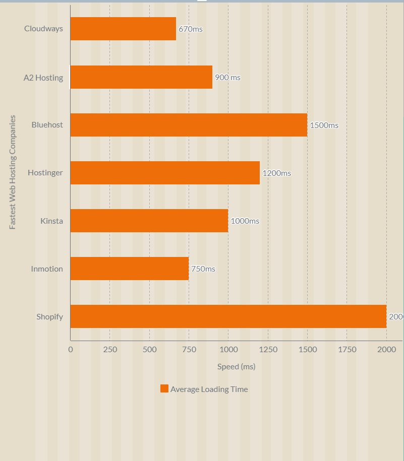
If you're looking for a top-quality hosting provider that can offer the fastest speeds possible, A2 Hosting is definitely the right choice for you.
2. Server Speed
Server Speed is a calculated by downloaded data per second from server. Server Speed = Data Loading Speed / Time.
However, the host server speed depends on several factors.
- When your browser getting first byte of information from the hosting server, it is called "TTFB". This is how long it takes for your browser to start getting information from the server.
- data loading speed from the server.
- Server-side language support for rendering into HTML
- Gzip compression is a software application for file compression, to reduce the size of your CSS, HTML, and JavaScript files.
How to Check Web Hosting Server Speed
You can test your website hosting responses to requests from different locations by using Pingdom. You can test free, accurate Worldwide Server Speed for your current host using Pingdom.
What is the best server speed?
The server response time recommended for the first byte is 200ms–400ms. Less is always better.
Faster servers improve page speed, which is a ranking factor in search engines and boosts online sales.
Server speed is a measurement for selecting our fast web hosting service, and the factor we need to measure is the TTFB and data loading speed of the server on which your website is hosted.
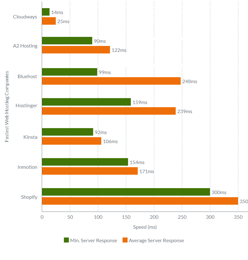
Here are the test results of server response speed times:
Web hosting server response times are an important metric to consider when choosing a web host. You can use this information to help you make a smart choice. We have gathered response times from the top 9 web hosting providers.
The results below are based on tests conducted from 15 different locations across the globe. As you can see, the response times vary greatly, with some providers offering much faster speeds than others.
I show results in three categories: fastest, slowest, and average response time.
- Fastest server response time: 14 milliseconds
- Average server response time: 25 milliseconds
3. TTFB (Time to first byte)
TTFB is the amount of time the browser waits before receiving the first byte of data from the server. The longer you wait for TTFB, the longer it takes to proceed with your other page resource request.
The slower the TTFB, the longer it takes for users to see content on your site.

How to check TTFB?
You can test your website's TTFB using a website like GTmetrix without paying any amount.
What is the best TTFB speed?
As per Google guidelines, Google heavily considers TTFB in search rankings.
TTFB times shorter than 300ms are great to have, TTFB times between 300ms to 600ms are acceptable, and anything higher is not suitable for your ranking and users.
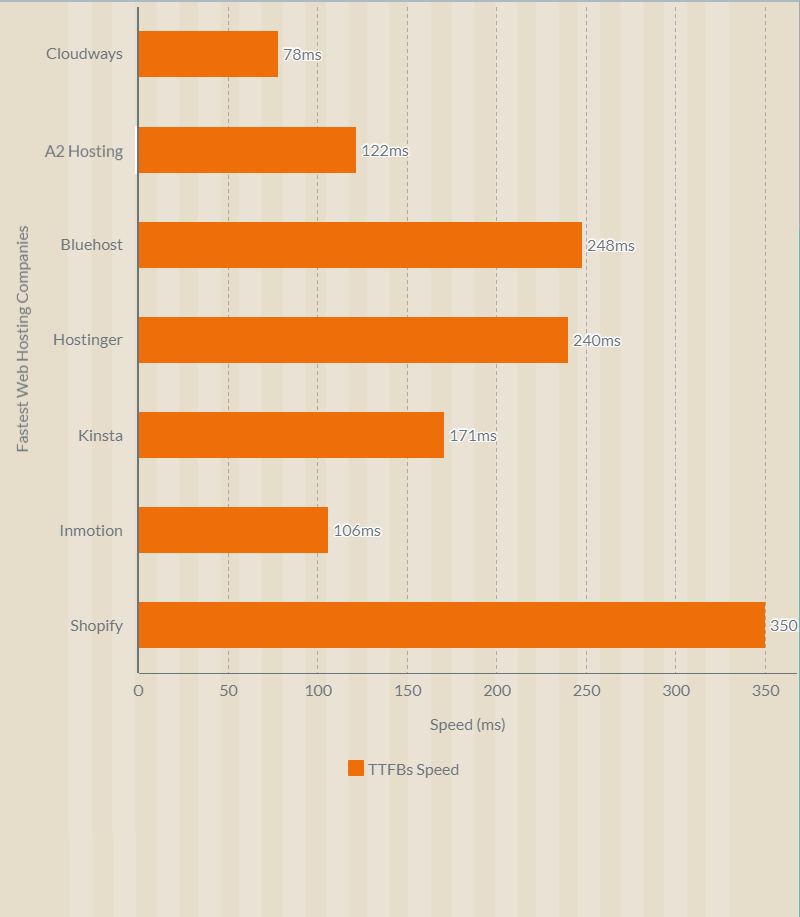
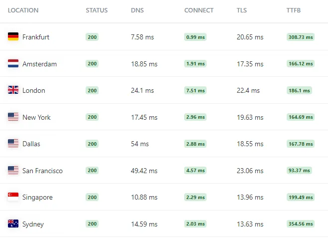
Here are the results of the time to first byte (TTFB) Test:
I also looked at the time to first byte (TTFB), which is the amount of time it takes for a server to respond after a connection is opened with it. This metric is important because it affects how quickly you can load a site after clicking on its link. In this case, I used Loader to get my data, and I checked TTFB from Australia, Canada, Germany, Japan, Singapore, the United Kingdom and the United States.
4. Server Loading Capacity
Simply How many loads can the server take during simultaneous requests per second?
Server loading speed also plays a vital role because it can impact the performance of your website.
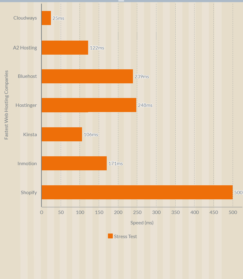
From the above image, you will understand:
We need a specialized tool like a stress tool to perform a server loading test.
The Stress Tool simulates lots of users by sending HTTP requests to a hosting server to test a server under heavy load in real-time. They make sure that your websites get enough resources from the servers to give users a good experience.
Here is an overview of how I carry out heavy-load tests. As you can see in the video, I send multiple requests to the server to check how it will respond.
Don't get confused by seeing variations in test results. The green line indicates concurrent user requests I send to the server, and the blue line is the response your website gets from hosting response time.
Here are the results of the Stress Test Server Response Times Test:
I conducted a Web Hosting Stress Test Server Response Times speed test to see how my website would perform under pressure. The results were fantastic!
My all-testing website handled the load and responded quickly to all requests. This is great news for businesses, as it means that all website hosting can handle any amount of traffic that comes their way.
5. Hosting Server Location
Hosting server location is important for customer latency and reliability because the lower the latency, the faster your users can get
Which server location is best for web hosting?
It is best to choose a location close to your user base, as this will decrease latency, TTFB, and load times.
As a business owner, you never want to worry about where your customers live. You care about fast response time and load time to deliver a good user experience.
Consider the following factors when choosing the best server location for your website:
- Consider your target audience. It's best to pick a data center that is in or near the United States if most of your visitors live there.
- See which data centers your web host offers.
- Check your data center's performance.
How to Check Server Speed at Multiple Client Locations?
You can use free, accurate server speed testing tools like Pingdom.
6. Hosting Storage Type
Storage type is the physical format of the storage media. There are three types: spinning disk, solid state drive, and storage area network.
Spinning disk storage is a traditional hard drive storing data on spinning disks. These disks can hold a lot of data, but they are slow to access.
Solid-state drive storage is a newer hard drive that stores data on solid-state chips. These drives are much faster to access than spinning disk drives, but they typically hold fewer records.
Storage area network storage is a type of storage where multiple servers can connect to a single storage pool. This type of storage is very fast and can hold a lot of data, but it is expensive and difficult to set up.
In addition to choosing a web hosting provider that offers reliable and fast web hosting, you'll also want to consider the storage type they use.
For example, some providers use solid-state drives (SSDs) for their storage, which can offer significantly faster speeds than those using traditional spinning hard disks. If speed is important to you, be sure to ask your provider about their storage type.
If you're looking for advanced SSD storage, NVMe SSD storage is the best choice. NVMe SSDs offer some of the fastest performance available, and they can be a great option if you're looking to speed up your website.
In terms of speed tests, NVMe SSD Storage is a new type of faster storage than traditional SSD Storage.In a recent comparison, NVMe SSD storage was found to be significantly faster than traditional SSD storage.
NVMe SSD Storage stands for Non-Volatile Memory Express Solid State Drive Storage. It is a newer type of storage that offers many benefits over traditional spinning hard drives. These benefits include faster speeds, lower power consumption, and more storage capacity.
The NVMe protocol allows for higher throughput and lower latency, which means that the drive can quickly communicate with the CPU. There are a lot of systems that need fast storage performance, like database queries and integrations. This makes it a good choice.
However, NVMe SSD storage does come with a higher price tag than traditional SSD storage. So, if you are on a tight budget, you may want to stick with traditional SSD storage.
I think this much knowledge is enough 😪.
Why Does Web Hosting Speed Matter?
Web hosting speed is a critical factor that significantly impacts both user experience (UX) and search engine optimization (SEO). A slow website can lead to frustrated visitors, higher bounce rates, and lower engagement.
Search engines, like Google, use page speed as a ranking factor. This means that faster websites tend to rank higher in search results, leading to more visibility and organic traffic. Google's recent algorithm updates have further emphasized the importance of page speed for both desktop and mobile searches.
How Web Hosting Speed Impacts Your Website
1. Conversion Rate:
- Websites that load faster tend to have higher conversion rates.
- A study showed that websites that loaded in 2 seconds or less had a 20% higher conversion rate than the average website.
2. Bounce Rate:
- A slow page load time can lead to a higher bounce rate.
- A high bounce rate can signal to search engines that your website is not relevant or helpful, hurting your rankings.
3. User Experience:
- A fast website provides a better user experience.
- Visitors are more likely to stay on your site, engage with your content, and return for more if it loads quickly.
4. Page Weight:
- The overall size of a web page, including all its files, can affect its loading time.
- Choosing a high-performance web hosting provider can help reduce page weight and improve loading times.
Additional Negative Impacts of Slow Website Speed
- Lower customer satisfaction
- Reduced page views
- Increased bounce rates
- Lost revenue
Investing in a web hosting provider that prioritizes speed is essential for achieving online success. It not only improves your website's visibility in search results but also enhances the user experience, leading to more engagement, conversions, and ultimately, a thriving online presence.
Conclusion
I hope this guide of the fastest web hosting companies has been helpful. I have tried to give you information about how and why speed is important for your website, as well as a list of some fast web hosting companies.
When selecting a fastest web hosting providers for your site, you need to consider a few factors. First, you need to decide what type of hosting you need. The best providers offer shared hosting, cloud hosting, VPS hosting, WordPress hosting, and managed hosting.
It's important to consider all of your needs and pick the one that fits best. Services like A2 Hosting, Hostinger, Cloudways, and kinsta offer a wide range of features and are great for long-term relationships. So take your time and compare every option before making your final decision.
Now we see the FAQ regarding web hosting and website speed.
Frequently Asked Questions Regarding Web Hosting and Website Speed
What is the speed of hosting?
Hosting Speed is a calculated by downloaded data per second from server. Server Speed = Data Loading Speed / Time.
Does hosting affect speed?
Yes, when we install a website, our hosting performance drops dramatically due to the interaction of server side languages like PHP and MySQL, which is why you need high-speed hosting for your website.
Website speed is affected by factors such as hosting speed, server location, DNS lookup, connect, redirects time, TLS connect, request time, Time to First Byte (TTFB), total time, page size, download speed, programming language, CMS, code optimization, server cache, and website template.
But only one fix can increase your website speed by more than 75%. That fix is by using the fastest web hosting for your website.
What is Fastest web hosting?
The fastest web hosting is the hosting service in which the TTFB of hosts is less than 300 milliseconds (ms) and has a higher bandwidth rate to load and upload data quicker (simply how much time it takes to download). Optimizing the quality of the user experience is important to your website's long-term success, and Google analyses PageSpeed Insights to evaluate rankings.
The fastest web hosting is the hosting service in which the TTFB of hosts is less than 300 milliseconds (ms) and has a higher bandwidth rate to load and upload data quickly (simply how much time it takes to download). Optimizing the quality of the user experience is important to your website's long-term success, and Google analyzes PageSpeed Insights to evaluate rankings.
To figure out how well a web page is doing, Google uses an open-source program called Lighthouse. A lighthouse is used to figure out how well a web page is doing. This tool can look at a lot of things, like performance, accessibility, progressive web apps, and so on.
Using Google's Web Vitals, you can get a list of the quality signals that are important for a good user experience on your website.
PageSpeed Insights scores can give a good idea of how users will feel if the website is slow.
Which is fastest web server?
Nginx and OpenLiteSpeed are lightweight and versatile web servers designed to be fast, lightweight, easy to configure, and optimized for critical speed while remaining security compliant and flexible. In comparison, the actual server test results at TTFB speed. OpenLiteSpeed outperforms Apache and Nginx. When compared to Nginx, OpenLiteSpeed has a higher TTFB.